Boston Winter Weather Analysis Capstone Project
TABLE OF CONTENTS
Tools used
Tableau | Python Pandas | Excel | Online Databases
Skills Used
Python Querying | Data Cleaning | Climate Change Research | Data Visualization | Presentations | Report Writing
Problem Statement
Growing up in the early 2000’s, I remember very clearly that by Thanksgiving there would always be at least one snow storm. Decembers were usually slightly too cold for a White Christmas, and throughout January, February, and sometimes March, there’d be layers of snow and ice on the ground until April.
Over the next decade, however, there seemed to be less and less snow. Storms would not show up until later points in the year, and as I entered adulthood, I would find myself sweating at the “coldest” times of year. Even nearby lakes became increasingly unsafe to think about walking on (some stopped freezing all-together!). This led me to wonder, “What happened all of a sudden?” Was it all in my head? Or has Massachusetts weather actually changed?
The Hypothesis
I hypothesized that there have been changes in local weather in my lifetime. Specifically, I think that in Massachusetts we have seen warmer days, more warm days, less snow, and when the first snowfall actually does come, it doesn’t arrive until much earlier in the season.
The Methodology
To put my memory to the test, I decided to look for historical weather data that described daily weather conditions and precipitation types and volume. To maximize available resources while keeping the data relatively simple, I focused my analysis only on Boston, MA. The data collected needed to have daily information throughout the year, primarily so that I could have additional data for days outside of the winter season as needed. This was especially true for months where snowfall is common like November and March, but even as far out of the winter season as October or April. This data needed to also go as far back as possible to allow for as much comparative data as possible. Lastly, I would need supporting data on El Niño and La Niña phenomena, as this has been known to have an impact on snowfall and temperatures, and therefore could prove useful in my analysis.
By looking at average temperatures, snowfall, and precipitation types over at least the past 30 years, I hoped to answer the following questions:
Has there been a shift in average temperature over time?
Has there been a change in when the winter’s first snowfall is? What about the last snowfall?
Has the frequency of snowfall changed during this time?
Have the average, median, minimum, and/or maximum monthly temperatures changed for winter months during this time?
Finding and Wrangling the Data
To conduct my analysis, I used four datasets in total, one primary dataset and three supplementary ones. The primary dataset is where a majority of my weather data came from, and the supplementary NOAA weather and NOAA ENSO datasets provided additional and older information on snowfall and El Niño and La Niña weather phenomena respectively.
Visual Crossing Dataset
My primary dataset was pulled from an online weather database run by an organization called Visual Crossing. Using their internal query builder, I tried different queries on the Boston area, eventually settling for data from January 1, 1973 to October 31, 2022. Most of this data was retrieved from the Boston Logan International Airport weather station, though data from 2000 onward had to be pulled as a mixed interpolation of several weather stations close to the Boston area to account for database errors. Data was pulled by decade until 2000, where it was pulled year-to-year.
All datasets had the same 33 columns and were combined using Python to create one 18,201 row dataset. The columns showed the average, minimum, and maximum temperatures and “feels like” temperatures for each day, as well as the days dew point, predicted precipitation data, wind speed information, astronomical information, new snowfall and current snow depth, weather conditions, and more.
Though useful, I noticed several features I would need to add to this data to make it useful. This included creating useful parameters to determine whether or not it snowed on a particular day and by how much, as the snowfall column in the original dataset was entirely null, as was part of the snow depth column. This was eventually corrected using a combination of the “icon” column, which described a weather-icon based on the day’s weather, and the difference in snow depth between one day and the next.
I knew I would need to extract from every unique day its month and season, and I also realized that I would need to define my own parameters for wintertime and local seasons. In Massachusetts, the seasons differ from convention, and I found it to be more accurate to define them as:
Winter - November to March
Spring - April and May
Summer - June to August
Fall - September and October
NOAA Weather Dataset
While the Visual Crossing dataset was incredibly useful, I found it limiting for my specific needs, as throughout my analysis I ran into several inconsistencies with snowfall occurrence and volume in the dataset. Later years in the dataset repeatedly showed any snowfall as 0.1 inches, or none at all, even on days that I vividly recall having been heavy snowstorms. This was found too late into my analysis to start again, and I thought it better to supplement my data with more information using NOAA’s climate data website.
The data here contained more accurate history on Boston snowfall, and the data shown was consistent with my and others’ memory. I was able to keep the data source consistent through the entire dataset, and all information was taken from and only from the Boston Logan weather station. I was only able to pull data from as far back as what appeared to be the weather station’s beginning, so the data collected went from January 1, 1936 to October 31, 2022. I appreciated the additional 40 years of data, as it would paint a more accurate picture of Boston weather patterns, but I decided to still keep my focus on the past 50 years as covered by my original dataset.
This dataset’s 31,716 rows contained information on a day’s maximum, average, and minimum temperatures, whether or not it snowed, precipitation in inches, and snow depth in inches. There were also multiple columns labeled WT01, WT02, etc. with 1’s or blank cells seemingly as a type of Boolean value. Eventually, from NOAA’s data dictionary, I found that these columns described whether or not a certain weather type occurred that day, and I realized that I would need to update the column names as I cleaned the data so that these weather types would be presented in a clearer way.
NOAA ENSO Datasets
The final datasets used in this analysis relate to El Niño and La Niña weather phenomena, collectively referred to as the El Niño Southern Oscillation (ENSO). El Niño refers to the warm phase of this oscillation and La Niña to the cold phase, and together they make up the “episodic departures from expected sea surface temperatures…in the equatorial Pacific Ocean.” These episodes can impact global weather patterns, influencing pressure systems, wind patterns, and precipitation, and I determined that information on these would be integral to holistically understanding any potential fluctuations in Boston’s Winter weather.
I pulled data straight from NOAA’s Physical Sciences Laboratory research website and wrangled them using Microsoft Excel to save on time. It would have been possible to manipulate the retrieved data in Python, SQL, or any other program, and such wrangling likely would have been more sophisticated. However, all my NOAA datasets were, once again, found late in the analysis process and I had to consider my time constraints when wrangling supplemental data.
The first dataset was a re-organized version of a table on NOAA’s page regarding past ENSO events with 127 rows and 4 columns. The original table had years labeled as being either El Niño, La Niña, or neutral years as far back as 1896, based on values from December-January-February ENSO measurements. In Excel, I laid these years out as my table rows and El Niño, La Niña, and neutral as my columns. I manually explored the reference table for which years applied to which weather episode, placing a 1 when a year matched a weather episode and a 0 otherwise.
Also available on the NOAA website was a list of the top 24 strongest ENSO event years by season, going as far back as 1985. There were separate tables for El Niño and La Niña events, and each column ranked years in 3-month intervals. For example, DJF meant an interval between December, January, and February, while JAS was an interval between July, August, and September. I manually entered these datapoints into Microsoft Excel as well, using the 3-month intervals on the websites as my columns and years as my rows, combining the data from both tables into one. As these events oscillate between each other, I was able to have intervals qualify as either El Niño or La Niña (or neutral) without any overlap, and I marked El Niño events with an “O”, La Niña events with an “A”, and all other values with an “N” for neutral. Once all the data points from the website were accounted for, I added counters for each event type as separate columns to track how many of these 3-month intervals qualified as each event type. This dataset was used mainly so that I could have an added depth of understanding with regards to which years were impacted by ENSO events and to what degree. I hypothesized that years with a higher count of these top-24 events might have more dramatic weather patterns than other years still marked as ENSO years, and therefore felt this data would provide helpful insights to my analysis.
Cleaning and Wrangling the Data
Visual Crossing Data
Wrangling my NOAA dataset shared much of the same loops and added columns as the Visual Crossing dataset. After loading it into Jupyter Notebook, I checked the data types of my columns and adjusted the date column from a string to a datetime, just as I had previously done.
After finding the definitions of the WT columns in NOAA’s data dictionary, I created a dictionary of dictionaries that related the original column name (key) to a dictionary (value), where the latter comprised of a descriptive name for its key and the description of this weather type as the value, as provided by the dictionary. I then looped through the values in each of my data sets, replacing the column names with the clearer descriptive name, and I made sure to fill any blank cells with 0’s to make the data in these columns more similar to Boolean values. From there, I added in the same for loop as I had used in the Visual Crossing dataset for adding month, year, season, and winter name columns to the data frame. Mimicking my primary dataset, I also added a Boolean column to check whether or not it snowed by checking if the snowfall column had a measurable amount of snow recorded or if the weather type columns snow or snow_blowing_drifting was True.
After re-indexing the data frame’s columns, I exported it to a CSV file. As I went through my analysis, this dataset proved itself to be more reliable in accurately represented snow days, though it is possible that there could have been missed snow days due to some overlap in frozen rain descriptions that I did not consider as true snow during my wrangling. The reliability of this data set also meant that, towards the end of my analysis, I determined that this was a better file to incorporate first and last snowfall Boolean columns. I added a separate, supplementary mini-dataset containing the first and last snowfalls of a season using the same block of code as I had used for my Visual Crossing data, and exported this data frame to another CSV file.
I cleaned and wrangled the Visual Crossing dataset using Python in Jupyter Notebook. Using the Pandas library, I uploaded the CSV files for each individual decade into the kernal and concatenated them into one large data frame. After checking the data types of each column, I updated the date, sunrise, and sunset columns already present to datetimes from strings. This let me manipulate the columns as needed. The sunrise and sunset columns were largely ignored in this work, but I left them in place just in case they would be important at a later date. I also updated its name to “date” from “datetime” to avoid confusion. To finish my first phase of data cleaning, I dropped the wind gust, solar radiation, solar energy, UV index, severe risk, and snow columns, as they were all entirely null
With the date column updated, I could now extract the month and year of a date with Pandas datetime commands month_name and year, and put them in their own respective columns for better use in my later analyses. I chose to have the month displayed as its name rather than an integer so that I may work with months categorically as needed. I started by creating blank lists for months, years, winters, and seasons, and I used a for-loop to iterate each row. Each date’s month was appended to the month list and its year to the year list using these aforementioned commands. I placed the extracted month in a temporary variable within the loop to assign a season based on the month. The assigned season, following the designations described above, was then appended to the seasons list. These lists were then added as columns in the data frame.
The next challenge was how to handle snow-specific data within the data frame. As with the previous block of code, I began with two blank lists, one to list how much snow may have accumulated or melted, and the other to list just snowfall. The former was calculated by indexing through the dates in the data frame and comparing the depth of snow for that date and the next. The difference between both values was assigned to a local variable to describe how much snow had either accumulated (positive value) or melted (negative value), and this value was appended to the accumulation list. To calculate how much snow fell in a day, I indexed through the values in the accumulation list and appended all values greater than 0 to the snowfall list. Anything else was simply set to zero, and the lists were also added to the data frame.
Continuing with wrangling snow-based data, I created two columns to hold Boolean values for weather or not it snowed or rained on a particular day. These once again started out with empty lists, one for snow and one for rain. Looping through the data frame rows, I appended a true value to the snow days list every time that either the snowfall value was greater than zero or that date’s icon was listed as ‘snow’. All other days were listed as false. For rain, I only based its boolean value based on whether or not the icon was listed as ‘rain’, as this was second on the icon list’s priority scale according to Visual Crossing’s data dictionary. These columns were added to the dataframe.
Using the True values from the data frame’s new snow_bool column, I created an index-like object that took the year, date, and month for each day that it snowed. Using this snow days list, I was able to calculate the first and last snow days in a season. This was my biggest challenge in wrangling this dataset, as it required accounting for different month and year values for data from a region where snow at almost any time of year is possible.
To accommodate for these constraints, I looked at snow dates by comparing them with the next and previous values in the snow days list, starting at the year and then the month of these dates. I book-ended the data by setting the very first value in the dataset as True for the first snow of the season, and the last value as last for its season. Otherwise, to calculate the first snow of a season, I compared a snow date’s year with the year of the previous date in the snow days list. If they fell in the same year, I would look at the absolute value of the difference between their months’ integer values. If the difference was greater than four months, the current index’s date was assigned as the first snow of the season. Similarly, if the year of the current index’s date was one more than the previous date, this same absolute value was considered and a snow day would be listed as the first in a season if this difference was exceeded.
The inverse of this formula was used to calculate the last snow of a season, where instead of comparing with the previous date, I compared the current index with the following one. When all snow dates were evaluated, a final pair of empty lists were created to align the Boolean values created using the snow dates list to the full weather data frame. Indexing through the dates in the whole data frame, if a value was not found in the first snow dates list, it was set to false, and if it did appear in the list, it was set to true. The same action was performed on the last snow dates list. These values were added to the weather data frames as new columns.
I then re-indexed the data frame columns to an order that I found more workable and exported it to a CSV file.
NOAA Data
Visualizing the Data
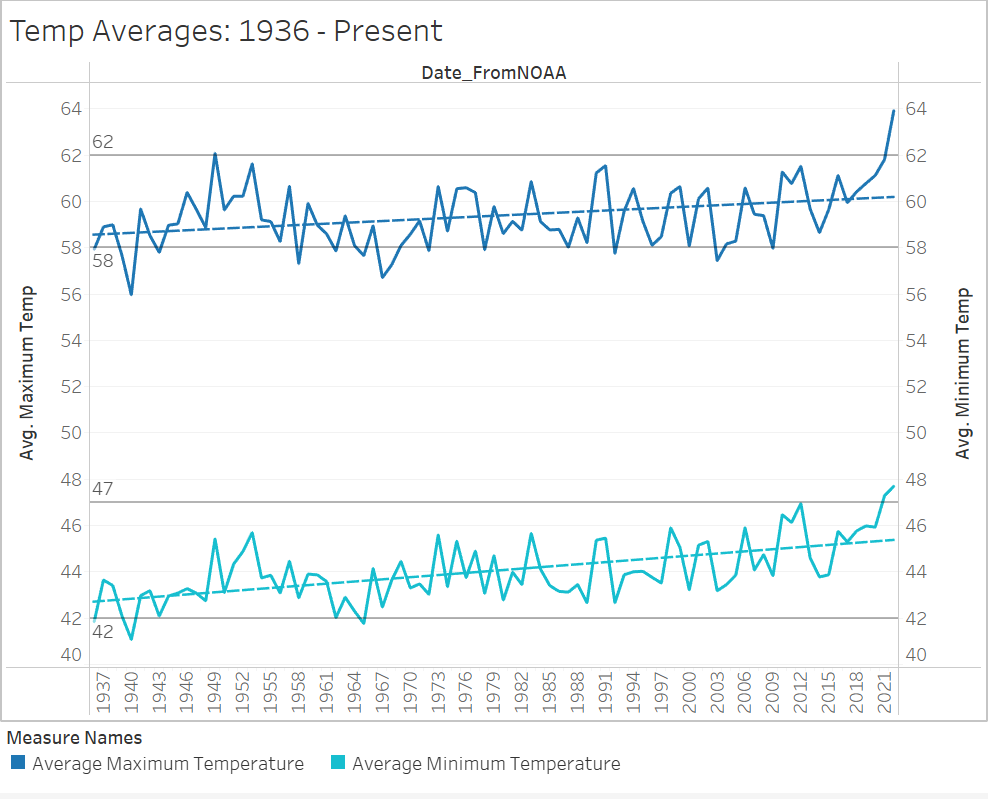
With my datasets cleaned and wrangled, I uploaded them into Tableau to begin visualizing the data for analysis. I began my analysis by looking at average temperatures over time to understand general patterns in Boston temperatures. I looked at these using a line chart, plotting average maximum and minimum temperatures from the NOAA dataset, and I found that, while seasonality was apparent, there has still been an increase in temperatures from a century ago. I added reference lines on the average temperatures in 1936 and in 2021 to better understand what these differences were, and I found that while 1936 average minimum and maximum temperatures were 42 °F and 58 °F respectively, and in 2021 these averages were 5 and 4 degrees hotter at 47 °F and 62 °F.
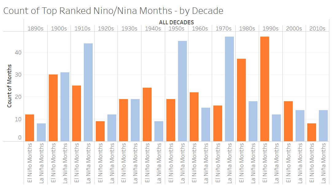
Having seen this increase in temperatures, I wanted to follow up by seeing how ENSO phenomena might have impacted the weather. Specifically, I was interested in seeing if there was any pattern in the frequency of ENSO events in recent years and the frequency and volume of snowfall in Boston. I started by showing the counts of 3-month intervals for El Niño and La Niña events side by side and from decade to decade. I placed the counter values for both phenomena from the 3-month ENSO database in my worksheet’s rows, and in its columns, I placed a calculated field categorizing decades by a date’s year. After overlapping these figures, I had a side-by-side bar chart that visualized both ENSO phenomena moving with time in an oscillating pattern, with some higher counts of El Niño months in the 1980s and 1990s.
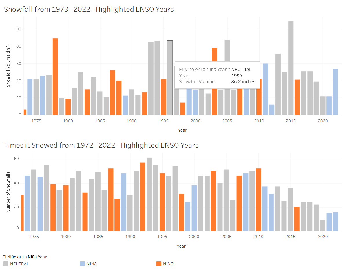
I then made two separate bar charts to observe how these phenomena could have influenced snowfall. For both graphs, I placed the “Year” variable in the columns so that I could see movement from year to year. To look at influences on snowfall volume I set my rows to be the sum of snowfall, while to observe influences on snowfall frequency I changed the rows to be the sum of true values for my NOAA dataset’s snow Boolean column. Both charts were color coded according to whether or not the year itself was an El Niño, La Niña, or neutral year. This color coding was done using another calculated field that categorized years by analyzing if a phenomenon was labeled as True in the ENSO Boolean dataset. This was to intended to show how either snowfall or snow frequency might have been different in either ENSO category, but ultimately, I found that there seemed to be no pattern relating to them. There were plenty of years that had high, low, or normal snowfall in either category, and while snowfall frequency seemed to be higher and not lower during El Nino years, there were enough years where this wasn’t the case that it seemed to be a negligible relationship.
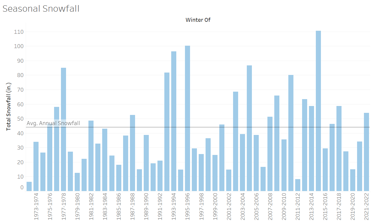
I wanted to look more closely at how snowfall may be changing from season to season, so I plotted the sum of snowfall against winter seasons. I found here that snowfall volume rises and falls, and that the past few years haven’t looked especially different compared to others from previous decades. I decided to place a reference line at our annual average of 44 inches, but even when comparing snowfall with this value, there didn’t seem to be any significant variation away from this value over time. I added color variation in response with average temperatures during this time, and did find that warmer seasons had less snowfall than colder seasons, but overall, the numbers don’t suggest that snowing itself has changed in any way.
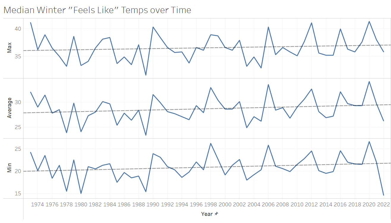
As I started looking into details about yearly snowfall, I shifted my focus towards “feels like” temperatures, as they would help account for both the low temperatures and humidity needed to snow. I also started to consider median values over averages, since I wanted a more consistent read on what winter temperatures were looking like, and I didn’t want these to be influenced by any potential outliers. I started by creating three line charts of the minimum, average, and maximum of median winter temperatures in my focus years, using the “Year” variable in my columns and these median temperature measurements in my rows to create three graphs in one. All three of these measurements showed steady increases over time. For added granularity, I took these same measurements by decade and used Tableau’s pages feature to scroll through values from month to month. Here, new patterns started to present themselves: from 2010 onwards, the monthly median feels-like temperatures appear higher than previous decades. For some months, these values weren’t too out of the ordinary and were even seen previously in the 70s. Other months, like March, were significantly warmer than before. Shockingly, the minimum temperatures rose the most, indicating that our low temperatures are not dipping to the levels they used to, and that months that might have had more variability are starting to show an abnormal shrinking of the gap between the highest and lowest temperatures. What’s more, March in particular had the most startling temperatures over recent years, as its temperatures stay closer to or above freezing, instead of varying over a wider range. This month typically gets its fair share of snow, but with warmer weather, that snow might be melting as it falls and not sticking to the ground
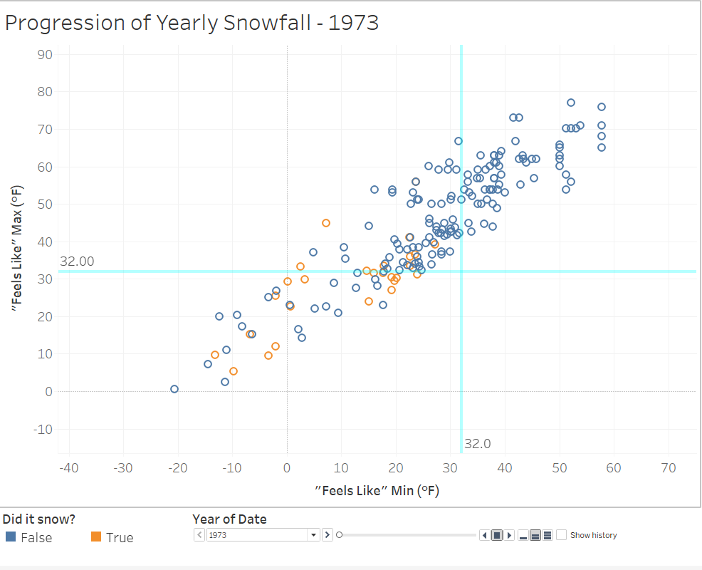
Next in my analysis was to consider these “feels like” temperatures as they related to snowfall. To watch how snowfall might have changed over time, I made scatter-plot of each day in the winter months using their minimum “feels like” temperature on the x-axis and the maximum on the y-axis. The plot points were colored using my snow Boolean from NOAA and were sized by the volume of snowfall, where the smallest point represented 2 inches of snow or less, and the largest represented just under 24 inches. I also added a reference line on each axis at the freezing point, so I could better track any possible movements in the data. I found that days where it did snow always had a minimum temperature at or to the left of the freezing reference line even when the maximum temperature might have varied more. Days that had the largest amount of snow showed both temperature readings below freezing, meaning that these days stayed very cold and allowed for bigger snowstorms. Over the years, more data points appeared to shift to warmer temperature values and clustered around each other more, implying less variability, just as the closing temperature gaps from the median temperature bar charts implied. Furthermore, there seems to be a decrease in the number of snow days with medium or larger volumes of snow, as well as in increase in snow day temperatures overall.
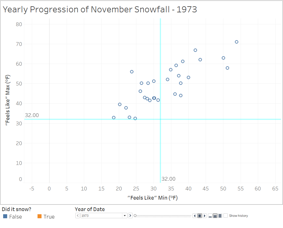
I duplicated this graph and filtered out all months but November to find any patterns in November snowfall to clarify my hypothesis on that month’s changes in snowfall. Based on this plot, November usually would see snowfall one to three times. Seasons without November snowfall would appear once in a while, but this skip would only last for a year. After the late 90s, these skips start becoming much more frequent and steadily increase to two and three years at a time. In this same time period, when it did snow in November, it decreased from a small handful of snows to just one. Between 2015 and 2021, it seems that there was only one November snow – in 2018.
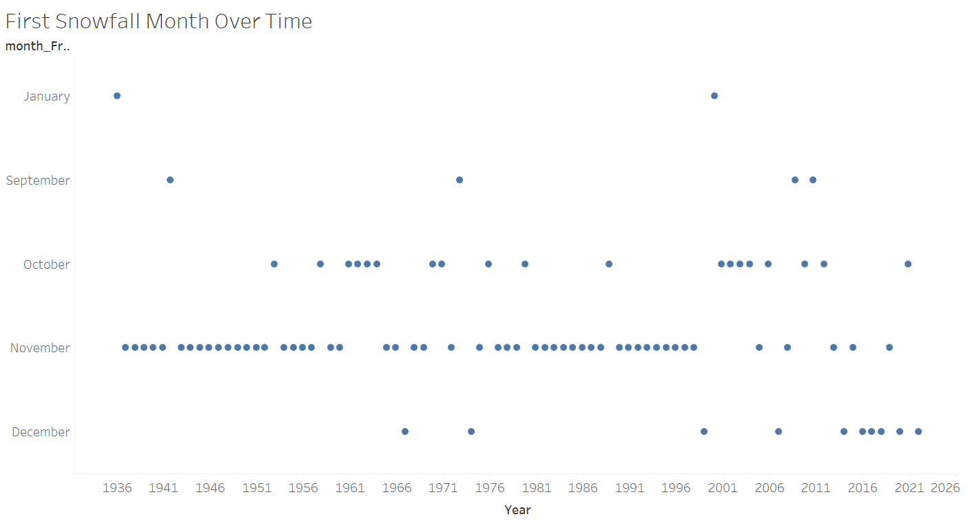
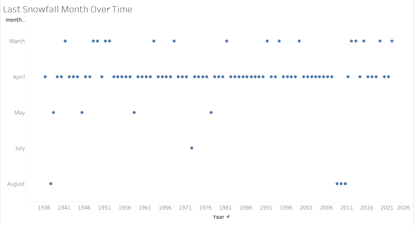
Finally, to see if the start or end of the snowfall season has moved, I made a box plot for each, listing the months of a year in the graph rows and the date of first or last snowfalls in the columns. These days were extracted by creating a calculated field that returned the date of all dates where the first-snow or last-snow Boolean columns were listed as True. I then filtered out months that had no first or last snowfall dates to make them visually easier to interpret. The first snow plot shows almost all years since 1936 having their first snow fall into November, with the occasional start in October every few years. Only twice does it dip as far late as December until the late 90s, when the start of the season begins to vary. Recent years are starting to regularly see snowfall start in December, and from 2013 this has been the case every other year. On the other end of the season, it still seems that snowfall stops in April, though within the past decade there seem to be more frequent, earlier ends to the season in March. This would imply that snow-friendly temperatures are beginning to lift earlier in the year – contracting our winter season on both ends of the spectrum, though with a slower shift on the spring-half of the season.
Conclusions
From my analysis of Boston snowfall, the data has been implying that despite rising median temperatures, it still snows in the area at similar rates that have been seen over the past 50 years. There is a possibility that with these warmer temperatures, the snow that does fall has not stuck to the ground as much as it used to, but this would require further analysis on any changes in snow depth over time.
Additionally, the past 20 years have started seeing fluctuations in the start and end of the snow season. Where in previous years, snowfall season reliably started in or by November and ended in April, the start of the season is starting to move more regularly to December and, less frequently, is ending more often in March. This implies that the transition from fall to winter weather is taking longer than it used to and the temperatures are starting to only be appropriately cold enough for snow later into the season. It also suggests that with earlier ends to typical winter weather that the entire season is being contracted on both sides of the spectrum, though with a slower shift in the springtime half of the season. What needs to follow this is further analysis on how these variations in temperature and season have impacted snow cover and, subsequently, how soil quality and greenhouse gasses have possibly changed in tandem.
